Scan QR code or get instant email to install app

Question:
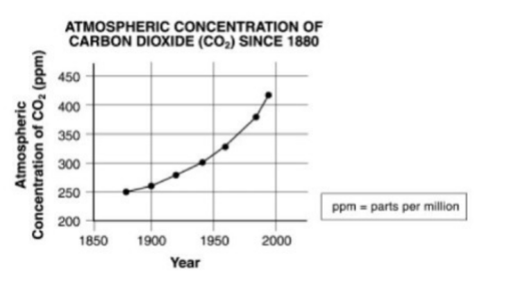
The graph below shows atmospheric carbon dioxide levels since the year 1880. Which of the following conclusions can be drawn from this graph?
A
Atmospheric carbon dioxide levels have been rising at an increasingly higher rate as the past century has progressed.
explanation
Because the graph shows a curved line, instead of a straight one, you can conclude that as time has passed (on the x-axis) the levels of atmospheric carbon dioxide (on the y-axis) have risen at increasingly higher rates. If levels had increased at the same rate, the line would be diagonal from left to right, but it would be straight.
Take more free practice tests for other GED topics with our ged test online now!
Related Information
Comments